


Opportunity:
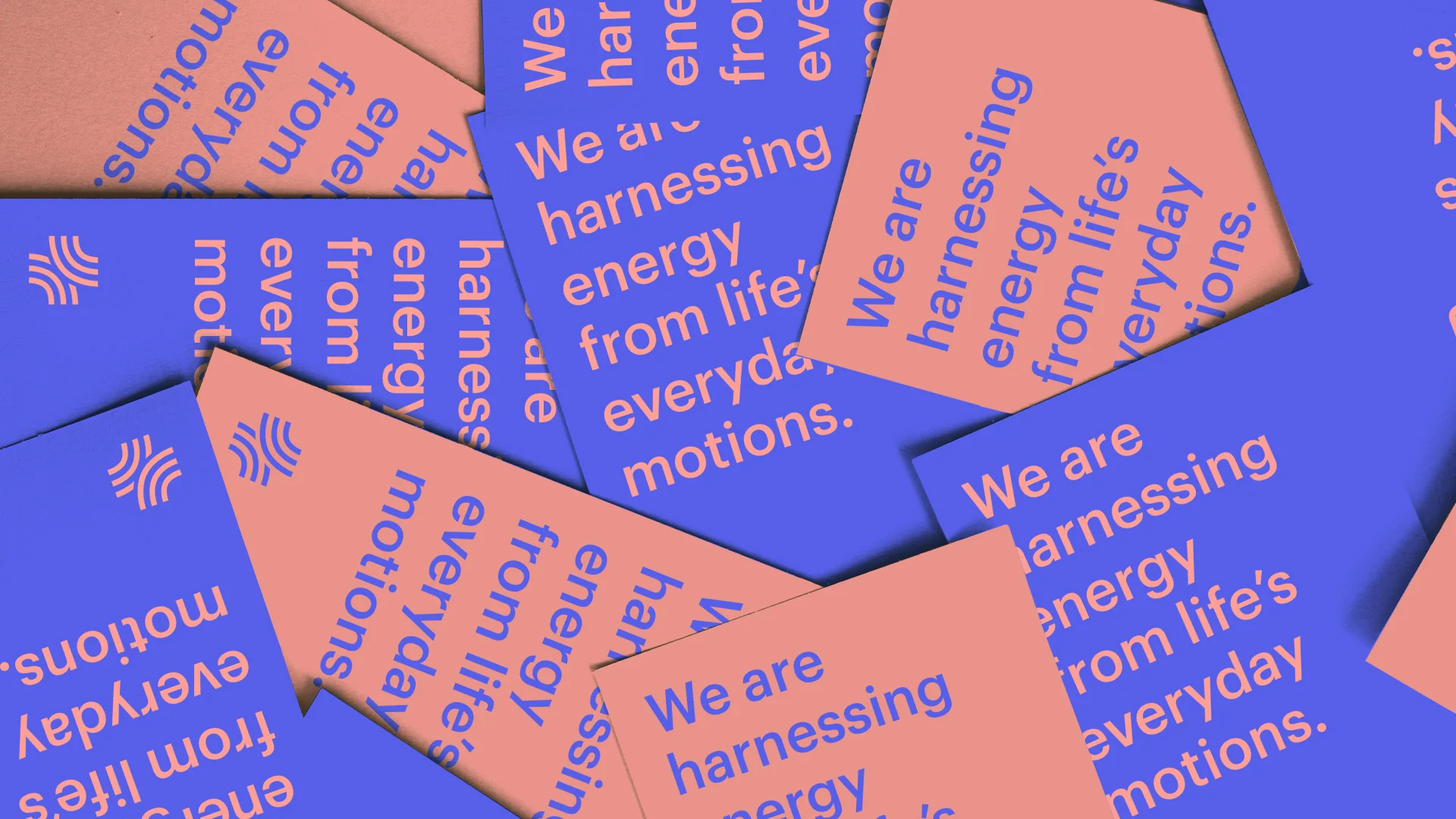
Plus is a company conceived to invent systems that turn human energy expenditure into usable power. They are beginning with a device that attaches to exercise bikes and creates energy while people work out. This is an invaluable experience that connects people to their very own power consumption.
The Solution:
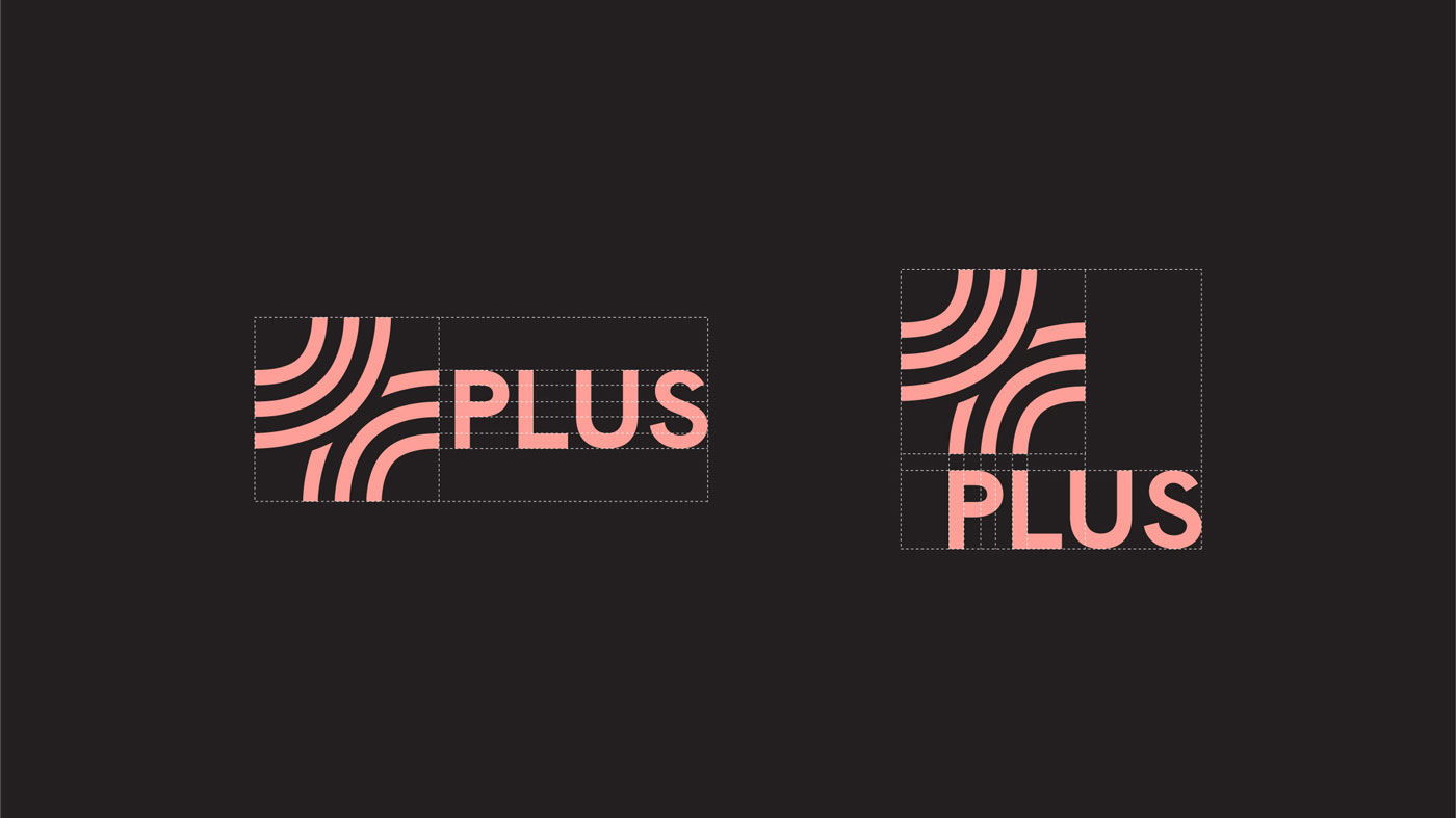
The idea of connection translates to the identity through the use of partial circles to create a simple "PLUS" symbol – a reference to the circular nature of renewable energy and to the company’s first products, which are all connected to wheels. Accompanying the mark is a vibrant gradient color palette and a line art-based illustration style that complements brand ideals of simplicity and positivity.
Role: Design Lead, Creative Director
Agency: The Public Society
Client: Plus Energy